
Designer of the Year Portfolio
Claire Kornberg
Scot Scoop · Highlander Magazine
Carlmont High School

Personal Statement
I always like to say, “design found me,” but in reality, I found design.
Kindergarten was the year everyone learned how to write — big letters, harsh strokes, jagged edges, and the impossibility of perfecting the letter “C.” While everyone else was racing to the finish line, pumping out letters faster than the speed of light to see who could claim the best spots on the monkey bars, I was focusing on what I now know as typography.
The “Claire” font, as I liked to call it, was over the top, replaced serifs with spirals, and channeled my inner Fancy Nancy. It was big. It was bold, and it took hours to perfect, much like my designs today.
In class, I’m known as the girl who gives her 110% on every brainstorm, spread, advertisement, and design I touch. My teacher likes to joke that I cost him too much money during the printing process because my out-of-the-box designs create spreads that are the furthest thing from minimalistic and ordinary, stretching the color palette to its limits and challenging my content producers in ways they didn’t think were possible; however, at the end of the day, they make sense, maintain an equal distribution of elements, and achieve balance.
Over the years, as my skills shifted from relying on templates to drawing my own elements in Adobe Illustrator, I learned that design doesn’t always need to be over-the-top; it doesn’t always have to be whimsical, avant-garde, or maximalist, no matter how much I might want it to be.
Through endless practice and countless nights where I failed to keep my promise to my parents that I wouldn’t stay up too late, I learned that the key to design is balance.
You can’t put a square block in a circular hole. I learned that in my design internship for my local community run — the Belmont Water Dog Run — where I was no longer designing for myself or for a magazine I hold deeply in my heart, but rather for a board filled with scientists, doctors, and avid runners, and most importantly, for my community. My square block — my “Fancy Nancy” designs — was no longer appropriate, and I quickly learned that to excel, you need to understand the audience, purpose, and the brand image you are maintaining.
My advertisement for Magna College Consulting, while not for the internship, perfectly encapsulates these values, drawing on preset logos, colors, and images to represent the company.
Once I learned these crucial facts to being a designer, ones I will carry with me to the ends of the Earth, I quickly rose through the ranks of my internship, earning the title of design team lead, where I do everything from managing assignments to critiquing and commenting on ways my designers can improve and harness their own skills. Not only did I develop a keen eye for design, but I also improved my skills, learning tricks on Adobe platforms and innovative ways to approach design tasks.
Although the internship desired an aesthetic consistent with its image, that does not mean that my personal flair never seeped through. While I learned about the purpose, the brand, and the audience, I also learned about creating harmony between what was desired and what was needed. I learned to harness my inner Fancy Nancy with a clean, brand-oriented layout. I learned how to create eye-catching designs without the need to employ every color of the rainbow and how to limit myself, to stop myself from going too far. I learned balance.
Today, my spreads can never be found as “too heavy” on one side of the page or too boring because they are straight from the style guide. They draw inspiration from photos and art, taking colors from dominant elements, like my spread, A home away from home, or finding ways to juxtapose ideas, such as revolutionary flying cars with a retro comic book motif, in Soaring into the future.
No matter the subject or story, I have learned that design is more than putting elements on a piece of paper or finding the perfect decorative font to captivate the audience. It is transforming the story into a spread, taking elements from clients and making their vision come to life, and, most importantly, creating a piece full of balance — between the colorless and the colorful, between the elements on the page, and between channeling your inner, over-the-top self and design practicality.
Thank you,


01: Newsmagazine Spread
for Creating a home away from home
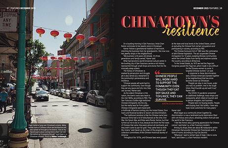

“Creating a home away from home” was my introduction to my design career. Found in the December issue, this spread shares the stories of different San Francisco enclaves and is driven by three key colors – red, yellow, and green. Along with white accents and a predominantly black background, which serve to emphasize the key elements of each page, these colors are found throughout, allowing me to provide the reader with recurring motifs of China and Italy, the two countries mentioned in the text. As for the headline and subheadings, I opted for a 3D look to make them pop and draw the reader's attention, while also orienting them to the next section of text, each of which is based on a different culture.

02: Newsmagazine Spread
for Soaring into the future
“Soaring into the future” is a spread about flying cars and the future of transportation, but what better way to portray these advancements than with a throwback to the style of 1980s comic books? This juxtaposition, which uses bright colors, heavy line work, and strategically placed polka dots, captures the reader’s attention and encourages them to engage with the story, while also containing the nostalgic feel of the traditional comic book. Early on, this spread made an abrupt pivot to this style, as it was a great way to express the idea of flying cars in an out-of-the-box style without being restricted by previous conceptions of what they should look like.

03: Newsmagazine Advertisement
for Magna College Consulting
The advertisement for Magna College Consulting presented a variety of challenges, including color and font matching and creating a transparent logo. I was inspired by real estate billboards, where the realtor is often seen alongside their message, and by the company's green color, which is used throughout the design to emphasize the most important element — the company name — as per my client's request. As the elements become less crucial to the advertisement, its font size decreases and moves closer to the bottom of the advertisement, further encouraging the reader to read in a top-to-bottom style and once again emphasizing the company name.
